How The Amity Affliction Inspires Themes, Templates and Graphic Elements on Dribbble
The name The Amity Affliction is most often associated with music, but their visual identity has also become a rich source of inspiration for digital designers. On platforms like Dribbble, that mood-heavy aesthetic translates into themes, UI templates, and downloadable graphic elements that creatives can adapt to their own work. This article explores how to capture that atmosphere visually and turn it into polished design assets your audience will actually want to download.
From Music to Mockups: Why The Amity Affliction Inspires Designers
The Amity Affliction is known for emotionally charged music paired with equally evocative visuals: stormy skies, silhouettes, grunge textures, and high-contrast typography. For digital designers, this aesthetic becomes a ready-made mood board for themes, templates and downloadable graphic elements shared on platforms like Dribbble.
Instead of copying album covers, smart designers translate that feeling into UI kits, landing pages, social templates and icon sets that carry the same emotional weight while remaining original and functional.
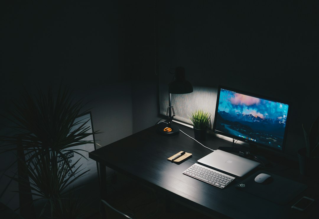
Core Visual Traits of a "The Amity Affliction"-Style Aesthetic
Before turning inspiration into a marketable design asset, you need to understand which parts of the aesthetic are doing the heavy lifting. With a style like The Amity Affliction’s, several traits consistently show up in visuals associated with the band and the broader genre.
1. Atmosphere Over Literal Imagery
Rather than bright product photography, you see moody landscapes, abstract fog, rain, oceans, and empty streets. These visuals communicate emotion more than information, which is powerful when used wisely in hero sections, backgrounds or cover graphics.
2. Dark Palettes with Strategic Highlights
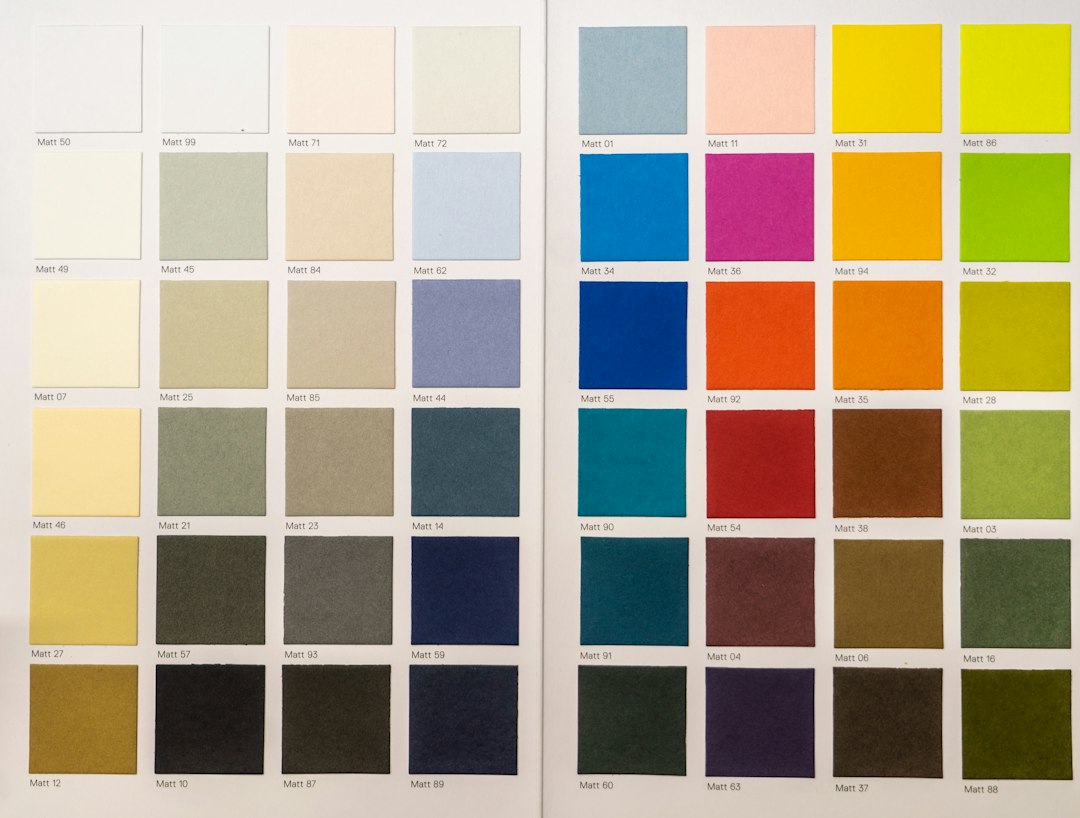
Blacks, deep blues, muted purples and greens dominate, but they rarely feel flat. Carefully placed highlights—neon accents, distressed white type, or a single warm color—create hierarchy and guide the eye through the design.
3. Gritty Textures and Layering
Subtle grain, dust overlays, ink smears and torn-paper effects add depth and imperfection. In UI templates, these details must be controlled so they don’t interfere with readability, but used lightly they bring character to backgrounds and section separators.
4. Expressive Typography
Type choices often mix bold sans-serifs with serif or script accents, echoing the contrast between aggression and vulnerability in the music. Tight letter-spacing for titles, generous spacing for body copy, and considered line lengths keep designs legible even when the mood is intense.
Translating Mood into Practical Themes and Templates
Turning a band-inspired mood into a sellable or shareable design means thinking about use cases. Dribbble designers often publish:
- Website and landing page themes
- UI kits for apps and dashboards
- Social media post and story templates
- Poster, flyer and cover art layouts
- Icon sets and micro-illustrations
Each format demands different levels of decoration and restraint. A poster can be visually loud; a dashboard must stay functional.
Web Themes
For web themes, apply the dark, cinematic mood to:
- Hero areas with large background images or gradients
- Section separators that use texture instead of hard lines
- Call-to-action buttons that pop with bright accent colors
Navigation, body text, and forms should remain crisp and minimal, balancing the overall drama of the page.
UI Kits and Components
UI kits inspired by this aesthetic can include pre-styled buttons, cards, modals and navigation patterns with:
- Soft shadows and glow for depth on dark backgrounds
- Subtle noise overlays to avoid flat blocks of color
- Carefully tuned contrast ratios for accessibility
Designing Downloadable Graphic Elements with This Aesthetic
Beyond full themes, smaller downloadable assets are popular on Dribbble because they’re easy to plug into existing projects. With a The Amity Affliction–inspired style, you might create:
Texture and Overlay Packs
Grunge, noise, paper and ink textures that can sit on top of photos or solid colors. Provide them as high-resolution PNGs with transparent backgrounds or layered PSD/AI files so users can adjust blending modes.
Background Collections
Atmospheric backgrounds—misty forests, abstract gradients, grainy skies—work well for hero sections and cover art. Keep them high-res and provide multiple color variations to increase their usefulness.
Typography and Title Layouts
Rather than distributing fonts (which often has licensing restrictions), offer editable title compositions:
- Pre-made wordmark layouts with placeholder text
- Overlay effects like halftone, glow, or shattered type
- Guides for how to align and space letters for maximum impact
Balancing Emotion and Usability in Dark-Themed Design
The biggest risk with heavily stylized work is sacrificing usability. An effective Dribbble template must look good in the shot and work in a real project.
Accessibility Considerations
- Maintain sufficient contrast between text and background, especially on dark surfaces.
- Reserve textured or photographic backgrounds for large display type; use solid or subtle gradients behind body copy.
- Allow users to toggle or reduce texture layers in your source files.
Typography and Hierarchy
Even when using expressive fonts, set up a clear system:
- Define heading levels: H1, H2, H3 with consistent sizes and weights.
- Pair fonts thoughtfully: one for headlines, one for body text.
- Use color sparingly: keep body copy neutral (light grey or white) and reserve accent colors for key actions.
- Test long paragraphs: ensure your chosen font and line length stay readable in longer text blocks.
Building a Reusable Style Guide for Your Asset Pack
If you want your Dribbble post to be more than a pretty screenshot, create and share a simple style guide inside the file. This turns your inspiration into a coherent system rather than a single shot.
Key Elements of the Style Guide
- Color palette: primary background colors, highlight colors, neutral text colors.
- Type scales: font choices, sizes, line heights, and letter-spacing.
- Spacing rules: base spacing unit (e.g., 4px, 8px) and examples.
- Buttons and inputs: default, hover, and disabled states.
- Texture usage: notes on when and where to apply overlays.
Quick Style Guide Template You Can Reuse
Include an artboard or page in your file with these sections: 1) Logo or project name; 2) Color swatches with hex codes; 3) Type specimens for headings, body, and captions; 4) Button states and form fields; 5) One sample layout combining all elements. This not only helps users but also makes your Dribbble shot feel professional and complete.
Positioning Your Dribbble Shot for Maximum Impact
Design work inspired by a recognizable band aesthetic can stand out, but presentation still matters. On Dribbble, the 800×600 preview is often your only chance to grab attention.
Composing the Main Shot
- Show a realistic usage of the template: a homepage, app screen, or pack overview.
- Include small thumbnails of variations or additional screens to hint at depth.
- Use clean framing around the design so the dark palette doesn’t blend into Dribbble’s interface.
Describing Your Asset Clearly
In the description and tags, be explicit about what users get:
- File formats (Figma, Sketch, XD, PSD, AI, SVG, PNG)
- Number of screens, templates, or elements included
- Intended uses: portfolio sites, music projects, creative agencies, social posts
- Any licensing or usage notes
Ethical Inspiration: Avoiding Direct Copying
When drawing from a band’s visual world, you must respect copyright and originality. The goal is to adapt the mood, not replicate branding.
What to Avoid
- Using official logos, album titles, or exact artwork.
- Tracing or re-coloring existing covers or promotional photos.
- Implying an official collaboration you don’t have.
What’s Safer and More Creative
- Abstracting the emotional qualities: isolation, catharsis, intensity.
- Creating your own photography, 3D renders, or illustrations with a similar mood.
- Designing flexible templates for artists in similar genres, without naming specific bands.
Comparing Dark Music-Inspired Aesthetics for Designers
If you’re exploring multiple inspirations for your Dribbble portfolio, it helps to see how different dark music-related aesthetics translate into design languages.
| Inspiration Type | Visual Traits | Best for Templates | Key Design Focus |
|---|---|---|---|
| The Amity Affliction–style metalcore | Moody landscapes, grunge textures, expressive type | Band sites, creative portfolios, merch stores | Emotional impact balanced with readability |
| Synthwave / darkwave | Neon gradients, grids, retro futurism | Landing pages, app promos, event sites | Color harmony and retro references |
| Minimalist post-rock | Monochrome, negative space, fine lines | Editorial layouts, portfolios, blogs | Whitespace and typographic rhythm |
Practical Workflow: From Concept to Downloadable Pack
To create a band-inspired, but original, asset pack for Dribbble, you can follow a streamlined workflow.
- Gather references: Create a mood board with album-inspired visuals, but also photography, film stills and abstract art.
- Define constraints: Choose 1–2 primary use cases (e.g., music portfolio sites + gig posters) and 2–3 main colors.
- Design core components: Build buttons, cards, titles, and textures that match the mood and work together.
- Assemble full templates: Apply components to 1–3 complete layouts or screens.
- Document the system: Add a style guide page explaining colors, type, and spacing.
- Prepare files for download: Organize layers, name components, and compress assets thoughtfully.
- Create the Dribbble shot: Showcase the best layout, add context thumbnails, and write a clear description.
Final Thoughts
Designers on Dribbble often look to music for visual cues, and a band like The Amity Affliction offers a distinct, emotionally rich aesthetic to work from. By focusing on atmosphere, color, texture and typography—and by translating those into structured systems instead of one-off artwork—you can create themes, templates and graphic elements that resonate with fans of dark, expressive design without copying any specific brand.
Handled thoughtfully, this kind of inspiration doesn’t just produce striking visuals; it also helps you build a memorable, coherent portfolio of downloadable assets that other creatives will actually use.
Editorial note: This article is an independent design-focused exploration inspired by publicly recognizable aesthetics and general creative trends. For more context, you can visit the original source at auroradesio.it.