High-Performing Landing Pages: Key Factors That Turn Clicks Into Customers
Landing pages are where your marketing efforts either pay off or fall flat. Every click you buy or earn eventually lands somewhere, and what happens in those next few seconds determines your revenue. This guide breaks down the core elements that make landing pages consistently convert, so you can refine existing pages or build new ones with confidence.
Why Landing Pages Matter More Than Ever
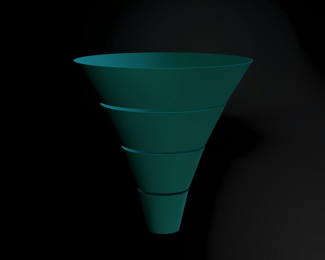
Every campaign you run — search ads, social ads, email blasts, or influencer promotions — eventually drives traffic to a page. If that landing page fails, your entire funnel leaks. High-performing landing pages don’t happen by accident; they are designed around clear goals, sharp messaging, and precise user journeys.
While different agencies and guides highlight different tactics, the recurring themes are consistent: focus, clarity, and relentless testing. In this article, we’ll walk through the most important factors that separate average landing pages from top performers, and how you can apply them without needing a full-time CRO team.
Defining a High-Performing Landing Page
Before optimising anything, you need a clear definition of what “high-performing” means for your business. For some, it’s a low cost per lead. For others, it’s direct purchases or qualified demo bookings.
Core Metrics That Matter
Most high-performance assessments are based on a mix of these metrics:
- Conversion rate (CVR): Percentage of visitors who complete your primary action (form fill, purchase, sign-up).
- Cost per acquisition (CPA): Ad spend divided by the number of conversions attributed to the page.
- Bounce rate: Visitors who leave without engaging. High bounces often signal mismatch between expectations and the page.
- Time on page & scroll depth: Indicators of engagement and content relevance.
- Post-click quality: Lead-to-opportunity or add-to-cart-to-purchase rates that reveal lead quality, not just quantity.
A truly high-performing landing page doesn’t just win the click; it aligns with your wider sales funnel and delivers leads or customers that actually convert downstream.
Factor 1: A Singular, Laser-Focused Goal
The most consistent trait of successful landing pages is ruthless focus. One page, one main goal. Anything that competes with that goal becomes friction.
Clarify the Primary Conversion
Ask a simple question: “If this page worked perfectly, what would users do?” Common primary goals include:
- Download a guide or checklist in exchange for an email address.
- Request a demo or consultation.
- Start a free trial or sign up for a plan.
- Make a direct purchase.
Once you define the primary action, your design, copy, and layout should push users toward that action without distractions.
Reduce Competing Paths
High-performing pages often remove or minimise:
- Full navigation menus leading away from the offer.
- Multiple equally-prominent CTAs (e.g., “Learn more”, “Contact us”, “Sign up”, “Subscribe”).
- Excess links to blog posts, social channels, or unrelated pages.
This doesn’t mean no navigation ever — but the user’s eyes should be guided naturally to the main call-to-action and its supporting content.
Factor 2: Message Match Between Ad, Audience, and Page
Message match describes how closely your landing page mirrors the promise made in your ad, email, or social post. The stronger the match, the lower your bounce rate and the higher your conversion rate.
Maintain Continuity From Click to Page
Think of the user’s journey as a promise chain:
- Ad or source: Makes a promise or highlights a pain point.
- Landing page hero: Repeats and clarifies that promise in clearer terms.
- Body content: Proves and details that promise with benefits, proof, and specifics.
- CTA: Offers the logical next step to claim that promise.
If your ad promises a “Free eBook on Facebook Ads for Local Gyms” but your landing page headline says “Grow Your Fitness Business”, that looseness in language can cause doubt and drop-offs. Align the page headline, imagery, and CTA copy tightly to the upstream message.
Segmented Pages for Different Audiences
Trying to serve everyone with one generic landing page is rarely effective. Instead, consider creating audience-specific variations with tailored messaging:
- Different industries (e.g., pages for gyms vs. pages for law firms).
- Different stages of awareness (problem-aware vs. solution-aware visitors).
- Different traffic sources (e.g., intent-rich search ads vs. colder social ads).
Even small changes to headlines, examples, and testimonials that match the segment can significantly lift performance.
Factor 3: A Clear, Compelling Hero Section
The hero section (what visitors see first without scrolling) is your landing page’s make-or-break moment. It answers three questions in seconds: Where am I? What can I get here? Why should I care?
Essential Elements of a Strong Hero
- Headline: A clear, benefit-driven statement that echoes your traffic source’s promise.
- Subheadline: One or two lines that clarify who it’s for and how it works.
- Primary CTA button: Visible, action-oriented, and above the fold.
- Supporting visual: Product screenshot, mockup, or contextual image related to the offer.
- Trust cues: Logos, review snippets, or credibility markers near the CTA.
Avoid cleverness for its own sake. Clarity nearly always beats creativity on landing pages, especially at the top.
Factor 4: Benefit-Led, Specific Copywriting
High-performing landing pages sell outcomes, not features. They translate what your product or service does into what it makes possible for the visitor.
From Features to Benefits
When outlining your offer, run each feature through the question: “So what?” For example:
- Feature: “Weekly performance reports.”
Benefit: “Know exactly which campaigns are profitable without digging into complex dashboards.” - Feature: “24/7 support.”
Benefit: “Get help whenever ad performance spikes or drops — even outside business hours.”
Benefits tie your solution to concrete improvements in time, money, or peace of mind, which drive action more powerfully than technical specs.
Use Social Proof and Specifics
Vague claims are easy to ignore. Specifics make your promises tangible and credible, such as:
- “Helped local businesses increase booked calls by 32% on average.”
- “2,147 marketers downloaded this guide in the last 90 days.”
- “Trusted by service providers in 15+ cities.”
Where you cannot share exact numbers, lean on qualitative specifics: types of clients, timeframes, or clear process points. Just avoid inventing details you can’t back up.
Factor 5: Frictionless Forms and CTAs
Even the most persuasive copy and design fail if your forms and calls-to-action create unnecessary friction. The smoother the path to conversion, the higher the completion rate.
Optimise Form Length and Fields
As a general rule, ask only for the information you truly need at that stage. A few guidelines:
- For low-commitment offers (checklists, newsletters), limit yourself to 1–3 fields (e.g., name, email, or just email).
- For high-intent offers (consultations, demos), slightly longer forms can help pre-qualify leads — but still remove anything you don’t actively use.
- Explain why you ask for sensitive fields, like phone numbers or budgets.
Make CTAs Action-Oriented and Reassuring
CTA buttons should say more than “Submit” or “Send”. Strong pages use copy that describes the value of the click and reduces anxiety:
- “Get My Free Audit”
- “See Pricing & Plans”
- “Book My 15-Minute Strategy Call”
Under or near key CTAs, reinforce low risk with short snippets such as “No credit card required”, “Takes less than 2 minutes”, or “You can unsubscribe at any time”.
Copy-Paste Checklist: Frictionless Lead Form
Before publishing your next landing page, run your form through this quick filter:
1) Remove all non-essential fields. 2) Replace “Submit” with a value-based CTA. 3) Add one short reassurance line under the button. 4) Test the full flow on mobile and desktop to ensure no errors or confusing steps remain.
Factor 6: Trust, Proof, and Risk Reversal
Visitors arrive skeptical. High-performing landing pages systematically address that skepticism with visible proof and risk-lowering elements.
Types of Social Proof That Convert
Consider including a mix of:
- Testimonials: Short quotes with names, roles, and if possible, headshots.
- Logos: Recognisable brands or local businesses you’ve worked with.
- Ratings and reviews: Star ratings or review counts from independent platforms.
- Data points: Summaries of results achieved for clients or customers.
Place proof elements close to your CTAs and claims; users look for immediate confirmation near the moment of decision.
Reduce Perceived Risk
Even when an offer is free, users mentally factor in time, spam risk, and sales pressure. Reduce that perceived risk with:
- Explicit privacy notes: “We never share your information.”
- Clarity on follow-up: “We’ll send 1–2 emails per week with new strategies.”
- Guarantees or trial policies for paid offers.
The goal is not to hide anything but to make what happens next feel transparent and safe.
Factor 7: Layout, Design, and Visual Hierarchy
Good landing page design isn’t about looking fancy; it’s about directing attention. High-performing pages use layout and visual hierarchy to guide users straight to the decision moment.
Design Principles That Support Conversions
- Whitespace: Give elements room to breathe so key messages are easily scannable.
- Contrast: Ensure headlines and CTAs stand out from background colours and surrounding text.
- Consistent typography: Limit font families and sizes; rely on weight and size for emphasis.
- Directional cues: Arrows, imagery, or eye-lines pointing toward forms and CTAs.
Visitors rarely read every word. They scan. Use subheadings, bullet points, and bolded phrases to make scanning reveal the complete story.
Above-the-Fold vs. Below-the-Fold Content
There’s ongoing debate about how much needs to be visible above the fold. What top-performing pages share is this pattern:
- Above the fold: Strong promise, context, primary CTA.
- Below the fold: Proof, details, FAQs, and secondary CTAs for those who need more information.
Don’t cram everything into the top section. Instead, ensure the top is compelling enough to encourage the right visitors to scroll and explore.
Factor 8: Speed, Mobile Experience, and Technical Health
Even the best content fails if your landing page loads slowly or breaks on mobile. With much of paid traffic coming from mobile devices, technical performance directly affects conversion rates and ad efficiency.
Page Speed and Load Time
Every second of delay increases the chance visitors abandon the page. To keep load times low:
- Compress and properly size images.
- Limit heavy scripts, unnecessary widgets, and large video files.
- Use browser caching and a content delivery network (CDN) where applicable.
Regularly test with tools like PageSpeed Insights or similar performance checkers to catch regressions as you add or change elements.
Design for Mobile-First
On smaller screens, layout mistakes become painful bottlenecks. High-performing mobile landing pages typically:
- Use large, tappable buttons with clear labels.
- Keep forms short and avoid tiny fields or complex dropdowns.
- Load critical content first, delaying non-essential assets.
- Use sticky headers or footers sparingly for key CTAs.
Always test the entire journey — from ad click to thank-you page — on multiple devices before driving serious traffic.
Factor 9: Continual Testing and Incremental Improvements
There is no permanent, perfect landing page. Even a strong performer can usually be improved by small, controlled experiments guided by data.
What to Test First
Rather than changing everything at once, focus on high-impact elements:
- Headlines and subheadlines.
- Primary CTA text, colour, and placement.
- Hero imagery or supporting visuals.
- Form length and field labels.
- Social proof placement and quantity.
Track statistical significance where possible, but even directional insights (e.g., big swings in conversion after a change) can inform your next iteration.
Simple Testing Workflow
You don’t need a complex experimentation program to benefit from testing. Follow a simple loop:
- Identify: Use analytics to find where visitors drop off or hesitate.
- Hypothesise: Decide what might fix the issue (clearer headline, stronger proof, shorter form).
- Implement: Create a variant and send a portion of traffic to it.
- Evaluate: Compare conversion rates and other key metrics.
- Roll out: Keep winners, discard losers, and document learnings.
Over time, these small improvements compound, turning a decent landing page into a reliably high-performing asset.
Optional: Comparing Common Landing Page Approaches
Different business models favour different landing page structures. While details vary, most fit into a few broad patterns.
| Landing Page Type | Primary Goal | Best For | Key Success Factors |
|---|---|---|---|
| Lead Gen (Short Form) | Capture contact details | Service providers, agencies, B2B consultancies | Strong hook, minimal fields, clear follow-up expectation |
| Content Download | Build email list | Marketing-driven businesses, SaaS, info products | Compelling asset, benefit-led bullets, instant access promise |
| Click-Through / Pre-Sell | Warm up for product page | Ecommerce, affiliate offers | Storytelling, objection handling, clear next step |
| Direct Response Sales | Immediate purchase | Courses, memberships, lower-ticket products | Detailed proof, guarantees, clear pricing, FAQs |
Clarifying which model fits your campaign helps you choose the right length, content depth, and level of detail.
Putting It All Together: A Practical Implementation Plan
Turning theory into a live, high-performing landing page requires a structured approach. Use the steps below as a practical roadmap.
Step-by-Step Launch Plan
- Define the goal: Choose a single, measurable action for the page (e.g., “Book a strategy call”).
- Clarify audience and promise: Write down who the page is for and the specific outcome you’re offering.
- Draft the hero section: Create a clear headline, subheadline, and primary CTA that mirrors your ad or email message.
- Outline supporting sections: List benefits, proof elements, brief process explanation, and FAQs.
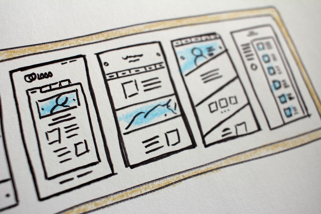
- Design the layout: Wireframe desktop and mobile views, prioritising clarity and visual hierarchy.
- Build and test: Implement the page, test forms and CTAs across devices, and fix technical issues.
- Launch with tracking: Set up analytics, conversion tracking, and event tracking for form interactions.
- Review and iterate: After enough traffic, identify bottlenecks and plan your first A/B test.
By following this cycle for each campaign, you build a library of landing pages that don’t just look good, but reliably convert traffic into leads and customers.
Final Thoughts
High-performing landing pages are less about clever tricks and more about disciplined execution: sharp goals, tight message match, benefit-driven copy, low-friction forms, strong proof, and continuous testing. When you treat each page as a focused, evolving asset rather than a one-time design project, your entire marketing system becomes more efficient — you waste fewer clicks, close more leads, and gain clearer insight into what your audience truly responds to.
Editorial note: This article was inspired by news coverage of a new guide on landing page performance from Boulevard Digital Marketing, as reported by CityBuzz. It is an independent summary and expansion, not an official publication of those organisations.